


Established in 1878, The Strong Family Farm is listed as the last historical, working farm in Vernon, Connecticut. In 2013, the farm adapted to modern needs by becoming a nonprofit agricultural education center where the community could experience an authentic family farm environment.
Role:
Duration:
Responsibility:
Graphic Designer
03/2023 — 04/2023
Design and format a brochure to drive local interest that showcased the farm's historical significance and seasonal activities for 2023.
"Amanda designed a beautiful brochure that brings out the theme of our farm in the community. We are all very excited with the outcome."
Jen Smith, Executive Director
CatchAFire.org Project Page
The Task
Design a mini booklet to introduce the farm's historic significance, and showcase the year's programs and services.
Requirements
Must be easy to read, include the address and contact information, and a QR code that directed to the website. Requested the final product be easily printed on an office printer.
Challenges
-
Lacking prior knowledge of organization
-
No design team members to collaborate with
-
No prior version to reference
-
Limited to A4 paper
-
Client will likely use a small-scale inkjet printer

Decided on a tri-fold style, knowing client has a lot of information to fit on one 8.5in x 11in sheet per brochure.
The Approach
Research Phase

Screenshots of company website.
The client provided a PNG of the farm logo, a collection of photographs, and a handful of points to include in the final design. To best represent the tone of the organization, I combed through the available website to copy as much wording as I could for accuracy, and parsed down longer explanations into quick overviews.
I looked through several free "farm brochure" templates. Common trends included rounded organic shapes, various shades of green paired with white, and circle-based iconography.
I wanted to see current composition and organization standards, and considered how my design could sit apart from generic templates.


Colors pulled from original logo, with additional green.
Colors pulled from original logo.
Tri-fold layout prototype.
Original logo PNG.
Drafting Phase
Using the provided logo to inspire colors and fonts, I added green to keep a sense of nature in the design.
I created a quick prototype to map where panels were compared to the computer screen, and started playing with imagery. I knew the brochure would be printed on thin paper, so I focused on using white silhouettes and blank space to avoid ink wrinkling the page.
While I worked with imagery, I asked if the original logo designer had provided an AI or SVG. The client managed to find an old SVG file, which allowed for more experimentation with colors, and better print quality.
Outside panels of Draft 1.
I initially struggled to incorporate the logo's dark blue into a lighter farm/nature aesthetic.
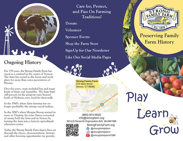
Draft 2: an attempt to simplify the color scheme into just blue and yellow.
Photo replacement and text changes made at client request.
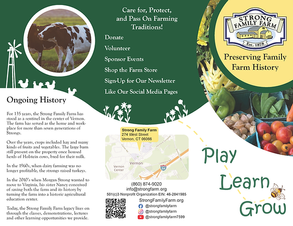
Draft 2.5: replaced blue with green.
Both drafts provided for client's opinion.
Troubleshooting
During edits, client asked why a white border appeared along the page edges whenever they printed the brochure. I explained the border was caused by the print margins of most home/office printers. Suggested solutions included revisiting the overall design so no elements touched the page edges, determine if the printer was capable of borderless printing, or seek third-party print services.
Client never said their decision, but continued to express satisfaction with the current design.
Finalization Phase
Client preferred the green based color scheme, and requested I update the farm logo with the green of the "Connecticut Grown" logo (an organization that aims to sustain and grow Connecticut agriculture and aquaculture).

Updated logo.
Original logo .png provided by client.
Client provided final updated text. I added the "Connecticut Grown" logo to outside-middle panel. Ensured QR code is live and auto-directs to organization website. Confirmed social media handles are accurate by visiting each profile.

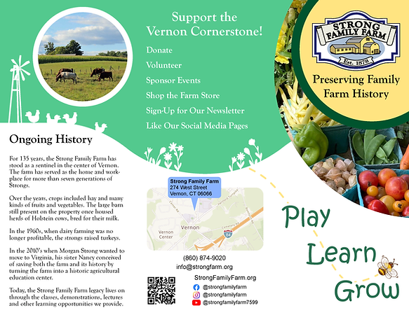
Final outside panels.
Listed activities with custom icons to break up white space, add visual interest, and further separate paragraphs.
Added website at client's request. Used the circle and inverted text color to separate information from the Scarecrow Contest description.

Final inside panels.
Close up of custom icons.
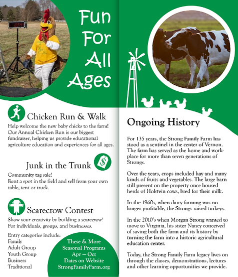
View of folded brochure interior when first opened.
The horizon line is designed to seamlessly connect neighboring panels no matter how the brochure is held.
The Extra Mile
Once the brochure was finalized, client requested a .docx file of the design that would allow as-needed text changes. I flattening design elements into a .png to import into Microsoft Word as a locked background, and added text boxes for all information. This method minimized the possibility of visuals unintentionally shifting/overlapping as text is added/removed.
The Deliverables
Client provided a link to a Google Drive folder that contained:
-
Print-Ready PDF
-
.SVG of Brochure
-
.DOCX of Brochure (with live text)
-
.TXT of Documentation
-
Folder of Working Files for Future Design Changes
Final Notes
Project concluded on schedule.
Client and their team expressed satisfaction with the final result, and excitement to begin using the brochure.
A positive, public review of the client's experience working with me was submitted to CatchAFire.org after the fact.