
"Art is never finished, only abandoned."
— Leonardo da Vinci
A designer's logo is an introduction, a signature, and an example of ability. A successful logo may stand for years, but always presents an opportunity for change. I approach every design with the best of my abilities. Given enough time I can feel prepared to revisit a since 'abandoned' design.
I included this redesign to showcase how I approach existing ideas and old challenges.
Role:
Duration:
Goal:
Graphic Desinger
1—2 days
Redesign personal logo for portfolio and social media uses.
The Journey
2014
During my junior year of college, graphic design students were tasked with creating a personal logo as part of a larger portfolio project. Below are the drafted designs and final result.
Version 1

An attempt to incorporate initials ARS. Experimented with breaking boundaries with the black circle.
Critical Hindsight
-
Elements outside the circle difficult to represent in black and white.
-
Thin lines illegible when scaled down.
-
Stylized, but doesn't represent my style.
Version 2
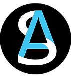
I cut the design down to two initials (AS), and used bolder lines. I liked the idea of merging the letters together.
Critical Hindsight
-
Still relies on three colors.
-
Curves and lines poorly merged.
-
Black circle used to compensate for unbalanced form.
Version 3
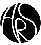
Removed blue color and turned toward a more handwritten/fluid direction. Explored the use of white space. Design used at assignment deadline.
Critical Hindsight
-
Letter forms are recognizable, but bland.
-
Black circle used to compensate for unbalanced form, again.
2016

Post-graduation, I put together a website and revisited my logo. Interested in freelance work, I focused on marketable skills and how to represent them: a paintbrush for illustration, a fountain pen for writing, and an x-acto knife for graphic design.
Critical Hindsight
-
Imagery not the best representation. Paintbrush suggests traditional paintings instead of digital illustrations. Potential clients may not recognize an x-acto knife or its applications.
-
Triangular shape is stronger than prior attempts, but elements feel disconnected.
2017
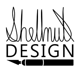
Focus shifted toward making handbound journals and sketchbooks to sell on Etsy. Created a more specific logo to put on the back cover of bound books. Worked a structured version of personal signature into design.
Critical Hindsight
-
Linework of name could be bolder to better ensure legibility when scaled down. Could benefit from line weight variation.
-
Rectangular design difficult to represent on circle-based profile pics of social media.
-
Connective curves between letters are inconsistent.
-
't' at the end of 'Shellnut' is an accurate depiction, but visually lackluster.
Current Redesign
Exploration

I used the cursive of the 2017 design as a starting point, and tried to blend an A into the cursive S. I felt the A blended too well, and played with breaking up the lines to bring it more forward. I liked the direction this iteration took, but remained unsatisfied.
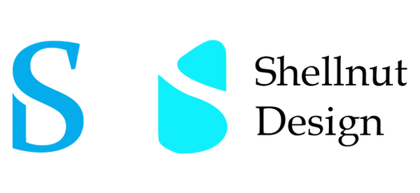
Considered a change in approach by merging S and D.

Returned to initials 'AS'. I focused on the reduced letter forms: triangles and curves. Felt close to something with the design on the far right.

I found a pleasing letter form in the Constantia typeface A, and added the S over it. Allowing the spine of the S to replace the crossbar of the A, I had a shape I could work with. I played with broken lines to keep the S visible, and liked the opening on the A's left leg. However, removing the right foot left the design unbalanced.
Final Design

I feel confident in this final design. The overall triangular shape is strong, with a solid base, and balanced without relying on perfect symmetry. The use of a typeface helped establish dynamic form and line weight variation. Finally, the simplicity allows the design to be legibly scaled up or down, remain recognizable in different color environments, and keep a sense of timelessness for as long as the design is in use.
