


Do or Die Publishing is an independent small press that stands for determination and perseverance. We're passionate about providing a platform for stories that don't quite fit the mold. Our commitment is giving emerging authors room to share their voice with the world. We believe that with enough hard work, anything is possible.
Role:
Duration:
Responsibility:
Business Owner
11/2021 — Present
Typesetting, artwork management, prepare packaging design for print, oversee printer proofs, and adhere to brand guidelines.
Brand Identity
Existing Elements
In 2017, Do or Die Publishing started with a name and a logo to launch AR Shellnut's debut novel.
In 2022 the logo was revisited, hoping to lean into how the company name appeared as "doordie" in URLs and email. The coffin-shaped double doors resembled the 2 Ds and the circular handles the O.
Original logo.
Good enough, but not satisfied with it.
Second logo, made in 2022.
Deemed too complicated.
2023 Redesign
Prepared to expand the company into an actual brand, I started by taking another look at the logo. I knew the transparent gradient was more indulgent than practical. Public opinion also confirmed the overall image failed to speak for itself.
An attempt to marry typography with the coffin motif.
Attempt #2 with a focus on simplifying shapes.
Final design after going in a different direction.
Decided against coffin shape due to unintended affiliation to the horror genre. The final design rose as a slashed D. This form felt more dynamic, hints toward 2 separate Ds, and better represents the duality of succeeding or failing.

Logo variations.
Finding the Look
After finalizing the logo, the next step was to determine a base aesthetic. Do or Die Publishing primarily focuses on action/adventure novels, which could lend toward bold and high-contrast colors, but in the end I decided to leave the excitement in the stories, and take the company in a direction that felt more refined and bookish.
The tan and soft browns are reminiscent of aged paper and quiet places to read. The muted green highlight adds an interesting change while rounding out the earth tones.
The logo and company name use the typeface Century Schoolbook, commonly used in print books. Due to platform restrictions, the website is noted using Caudex typeface, chosen as a nice companion serif font.
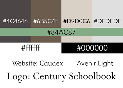
Reference .png of hex codes and typefaces for consistency.
Web Design
Desktop Site
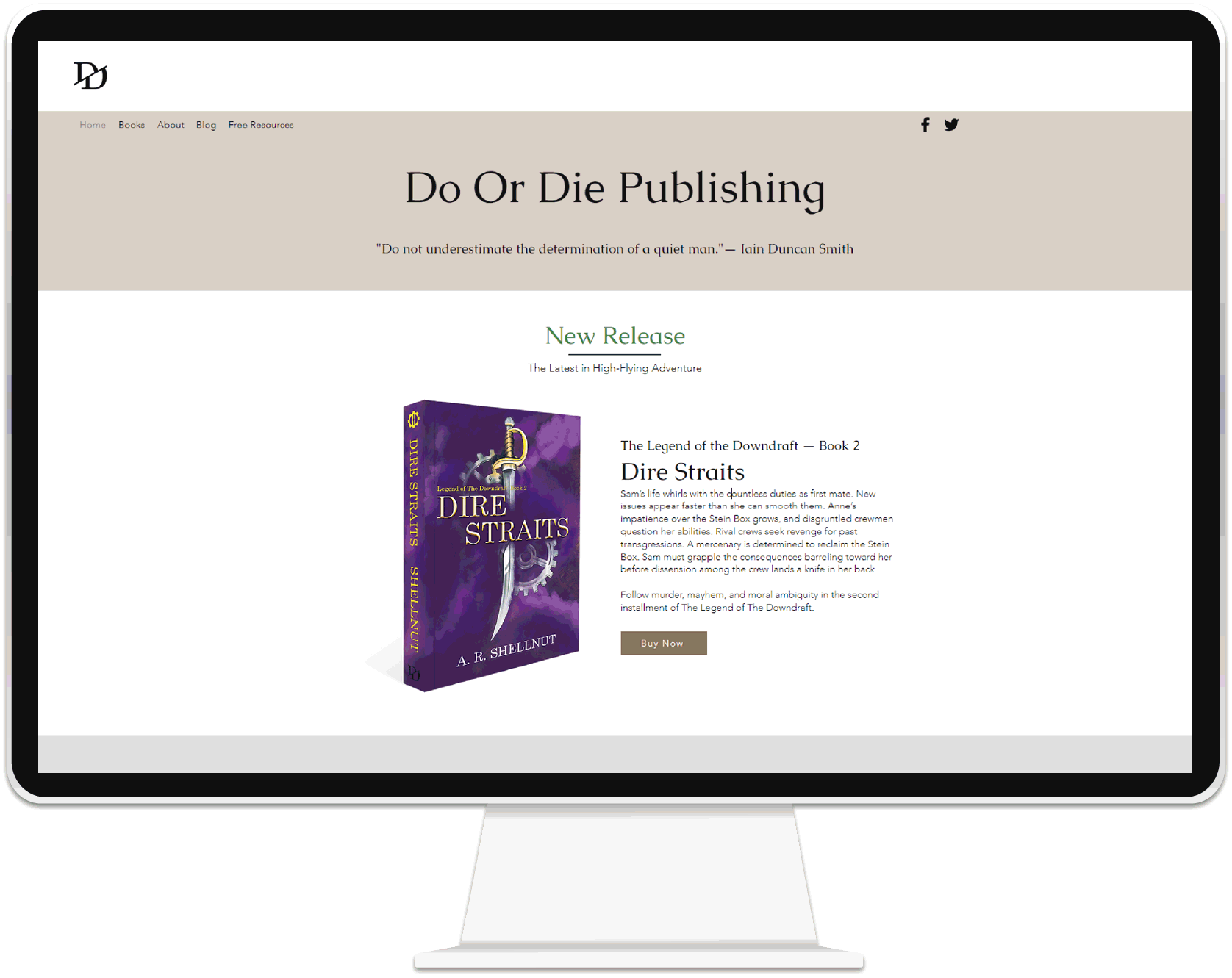
For a company that operates 100% online, the website was the main concern. The site needed to provide a space for existing and new readers to discover new books, and sign up for news of upcoming launches. I also wanted to share resources with the rest of the independent author community.
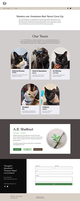
Company About page.
The owner truly has 5 cats.
I needed the site to be professional, while allowing a splash of personality through. Another aspect is appearing simple without feeling empty. The company is relatively young and ran by one person, which limits available content. I used white space and large images to lengthen the page while making sure new content appeared with every scroll down.
The About page features clean organization with different background colors acting as containers without true boundaries. The varied sizes avoid the feeling of stale uniformity while keeping the overall information well organized.
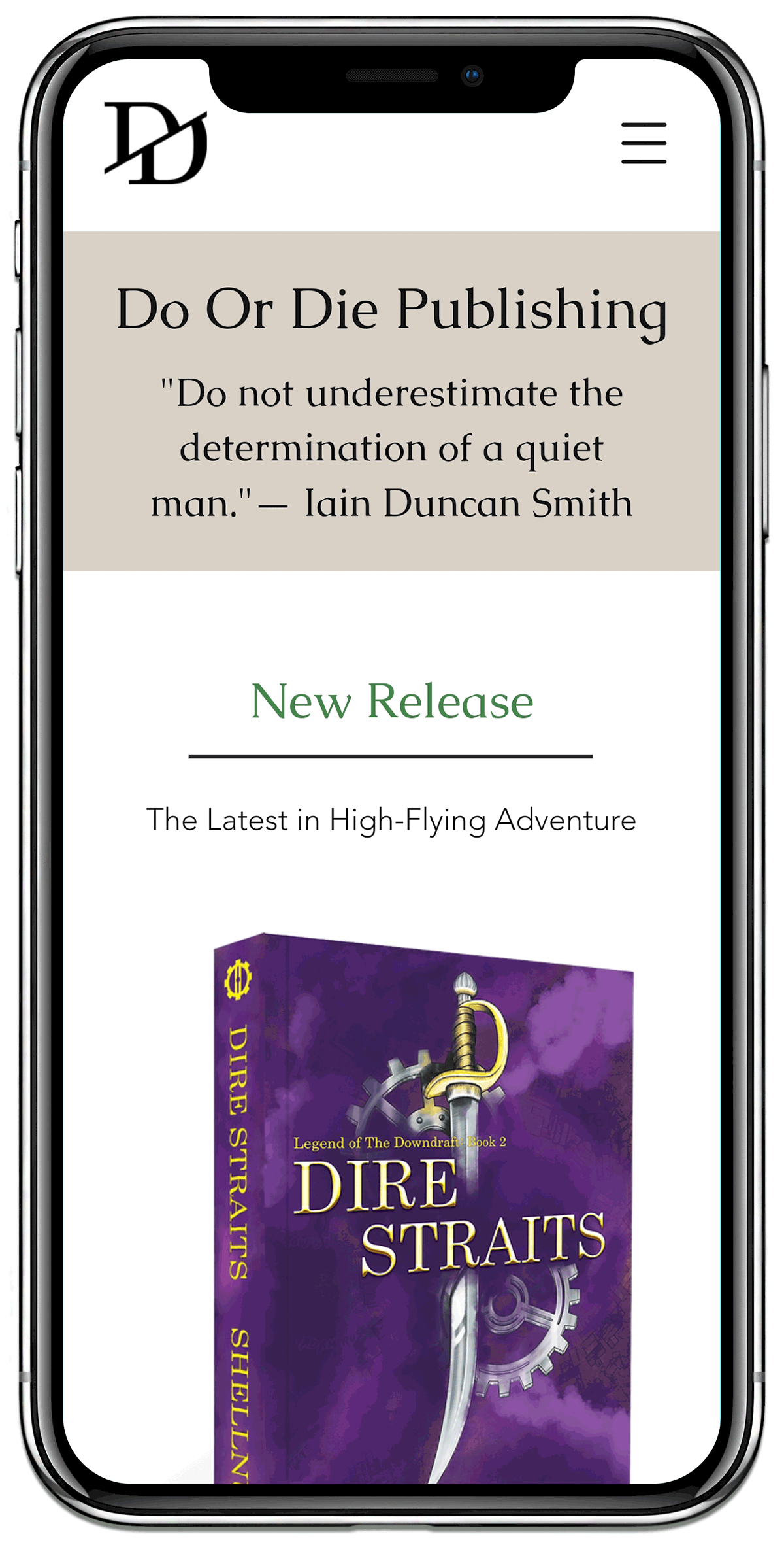
Mobile Site
Since a large amount of online content is viewed on mobile devices, I knew I had to put equal care into organizing a mobile layout. Due to the limited width of a phone or tablet screen, I put less emphasis on imagery by replacing large pictures with color blocks to separate topics.
I added a company blog as a source of information for other independent authors, and a reason for readers to regularly return to the site. The web platform Wix had a built-in blogging utility that controlled major layout options.

Book Design
Interior Layout
Preparing manuscripts for print is a series of small details that pull the product together. I explored several ways to present page numbers. Each version is an acceptable method in the publishing industry, and came down to personal preference.
From personal experience with paperback books, placing the page numbers in the corners make it easier for readers to find a specific page, and putting the numbers at the top minimizes obstruction from the reader's hands.


Series of possible chapter title page formats.
Similar to page numbers, several layout options for chapter title pages were based on designs common to the industry and came down to personal preference. I did take into account how aesthetic related to genre. In the end, I chose a simple layout with white space that provided a clear break from the prior chapter.

Final result of interior layout.
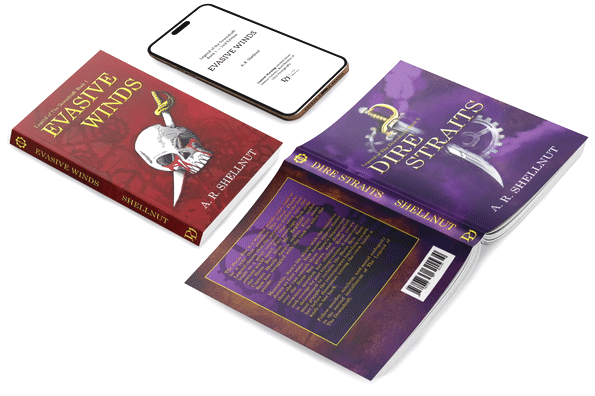
Cover designs of two novels in a series,
and an example of the ebook viewed on a smartphone.
Exterior Design
I designed the covers for the first and second novels of an ongoing series. While the main imagery of the covers represent each book, I gave consideration to elements I could carry through future installments for a cohesive look. These elements included a gear and cogwheel motif, a background made of obscured maps (specific to the locations used in the stories), and the source of the foreground images: detailed illustrations of pirate ship emblems. The story centers on pirates, which allows me to use a common theme without relying on recycled imagery. Each cover will have a different primary color paired with yellow lettering.
Closer view of front covers for books 1 & 2.

Numerical cogwheel icons.
Left to right are numbers 1-3 and 4-6.
Additionally, the spine of each novel features a cogwheel icon designed to represent the number of the book in the series. The number of books in the completed series is currently uncertain.
Final Thoughts
As designer and business owner, I am happy with the current state of this sizable project. The business has a visual identity that stands apart from the products it houses, the website is designed to easily expand as new products arrive, and the ongoing book series has a clear artistic direction for further installments.
Additional Material

Marketing image used to post on social media.